
On Peter Gabriel's "Melt" and Steve Biko
Published on Feb 21, 2026
Be Sure to Wear Flowers in Your Hair
Published on Jan 19, 2026
WALK OUT TO WINTER: falling in love with—and to—Aztec Camera's High Land, Hard Rain
Published on Dec 26, 2025
First Anniversary
Published on Dec 17, 2025
More Liner Notes…
Featured Essay: Judge a Record by It's Cover: What Makes Good Album Art
by Jason Bombach
Hello and welcome to a hopefully recurring column called ‘Judge a Record by Its Cover,’ where we explore the art and science of record packaging and presentation. The importance of album art is often overlooked when thinking about a record you are putting out. You might be thinking you’ll just slap some random band photo on there and call it a day. After all, it’s the music that really matters right? Well, while technically correct, the music is ultimately what matters most, just like when everyone scrolls through Tinder, people usually only pick up the records that they find aesthetically pleasing. So while a good album cover won’t make up for terrible music, it can get people to listen in the first place.
With that in mind, I want to use this inaugural column to go over some of my do’s and don’ts of album packaging. These are not hard and fast rules obviously but mere general guidelines to be broken as you see fit from someone who not only collects records but has put a few out himself.
When it comes time to put together album art it needs to do two things, compliment the music and convey pertinent information. The former seems obvious but if you are going through the trouble and expense of pressing a record, you need to think of it as a complete presentation and not just a container for a collection of random songs. Everything about the art should be aesthetically consistent with the mood or message of the music contained within. If I pick up a record with a dark and gloomy cover and the songs are all poppy surf songs, I’m gonna be confused. Remember, you are not doing this in a vacuum. Use and/or subvert cliches and cultural signifiers of the past. We all know a gangster rap record when we see one and would not mistake it for a folk record. A jazz record is very different from a metal record. Use the art as a vibes check for the album you’ve recorded and reflect that to potential listeners.
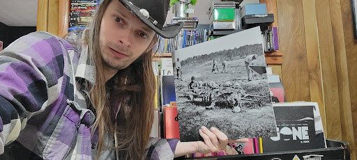
I have a record by D. Charles Speer & The Helix called Leaving The Commonwealth that is the prime example of what not to do. On the cover is a black & white photograph of what seems to be people digging up a mass grave. Everything about this record screams hardcore punk. From song titles like Razorback to the fact that it’s on Thrill Jockey, a label that puts out heavy, noisy music, I bought this (from a local shop that specializes in punk and metal no less) expecting some good old fashion D-beat punk. But this is a country record. Like a hoe down, honky tonkin record. I was so confounded I had to check if there had been a mix up at the pressing plant but no, it was the right record in the sleeve.
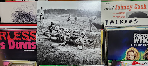
This record also failed at our second criteria, conveying information. The band name or album title are nowhere to be seen on the cover. I know artists like to be mysterious but I need to know who you are and what I should call this thing when I tell other people about it. If you’re a hit, you might be able to get away with a Self Titled or a color, but what would I call this D. Charles record? The mass grave album? Doesn’t exactly entice all the cowboys out on the range does it?
The band name and album title is the minimum information for the cover and/or back cover of the record. Even if you have to put it on a sticker adhered to the shrink wrap, that’ll do. As long as I know who and what I’m buying. But if you’re trying to keep the outside clean and simple, there are other ways to present finer details like lyrics, album credits and other notes. The inside of a gatefold works great if you have the money to spend but feels a bit like a waste of space without a double LP. An insert or printed sleeve are often a great way to go. Printed sleeves are great but paper sleeves are also fine. Anything but those bullshit plastic bags that never go back in easy. I’d rather a record rattle around loose than deal with that thin crinkled mess.
Of all the finer details to include in your packaging, a tracklist is the only necessity. Lyrics can be left up to interpretation and credits are nice but you are trying to take me on a journey with your music. So I need to know where this journey starts and have signposts along the way. This is doubly true for the oft overlooked center labels. As a former radio DJ, I need to know what song I’m queuing up and at what speed to play it, if it’s at a different speed than one would expect. I know you want to be creative and have a butterfly side and a cockroach side or whatever but that doesn’t tell me how you want me to listen to this record you’ve worked very hard on. Center labels should be clear and concise. I’m not Nic Cage and your record shouldn’t be some puzzle to solve.
One finer detail that isn’t a must but is still nice is a thank you section. Every record should be simultaneously treated as if it’s the last one you get to put out and the one that turns you into an international sensation. So put a little note in there for the ones that helped out and bring the homies up with you. I’ve discovered many a band in liner notes. It’s a nice way to give back.
Record packaging isn’t just the box you put songs into. On one hand it’s an advertisement for the product you’re trying to hock. It’s not sexy and people don’t like to think of it like that but what can I say, it is called the music business. But even if you’re uninterested in their money, you are competing for people’s attention. So you need a billboard that will capture their imagination enough that they will be willing to shell out real money to hear you sing your little songs. On the other hand though it is a visual expression of the music you’ve made. It sets the mood and context for what the listener is about to experience. Think of it like a beautifully drawn map. Full of important information but also pleasing to look at. So whether you use a black & white photo of a mass grave or a 3D lenticular cover or even try to make it easy on yourself by following a template like label Sacred Bones or the band Chat Pile, make sure you follow through with clear intention as this art will follow these songs forever. Good art won’t fix bad songs, but bad art will keep someone from hearing good music. Till next time!
Jason Bombach is an aging left wing punk who makes music under the name History History, writes, and shoots film. But mostly he scrubs toilets for money and is an organizer for the IWW. Check out his YouTube channel Death to The Algorithm or don’t. Yell at him on Bluesky at thecurmudgeon.bsky.social
I Have That on Vinyl is a reader supported publication. If you enjoy what’s going on here please consider donating to the site’s writer fund: venmo // paypal
